Decluttering DBS
UX/UI Design
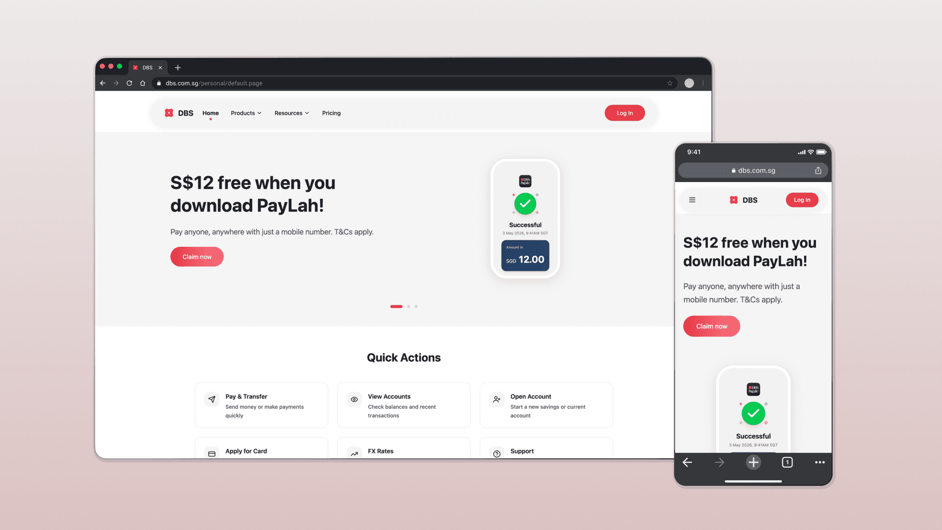
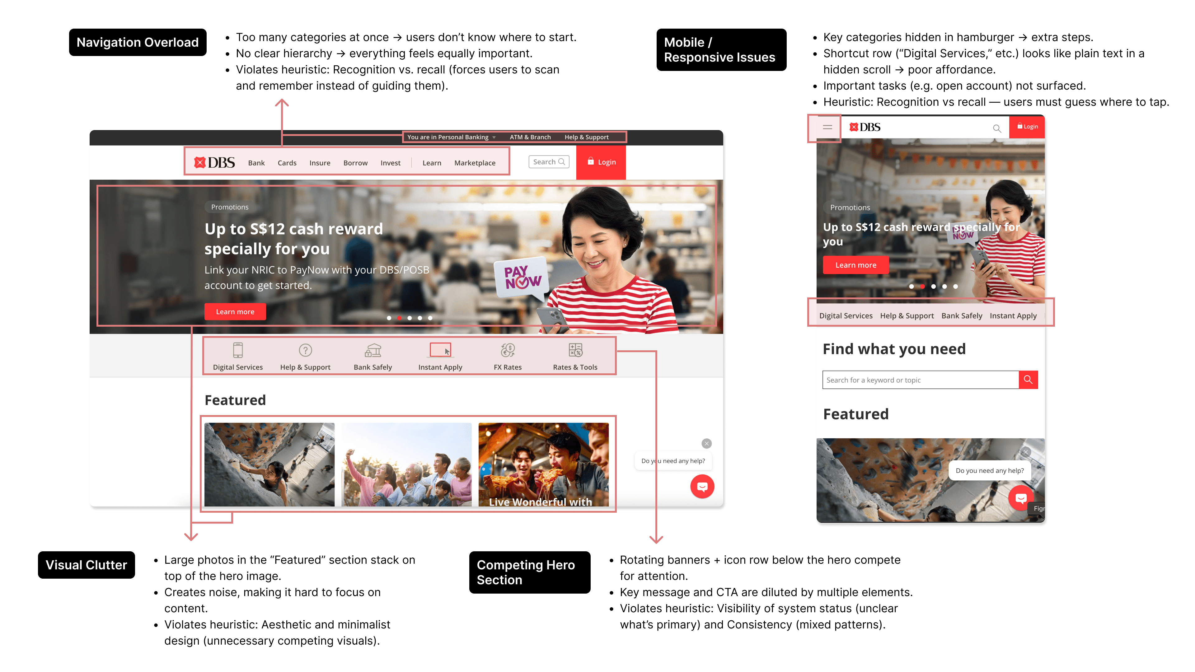
A self-initiated heuristic audit of the DBS personal banking homepage, followed by a one-session redesign to validate how quickly structured thinking translates into tangible decisions.
Note: This exploration intentionally moves toward a cleaner, product-led aesthetic. It's not a commercial banking redesign and doesn't attempt to replicate DBS's brand direction.
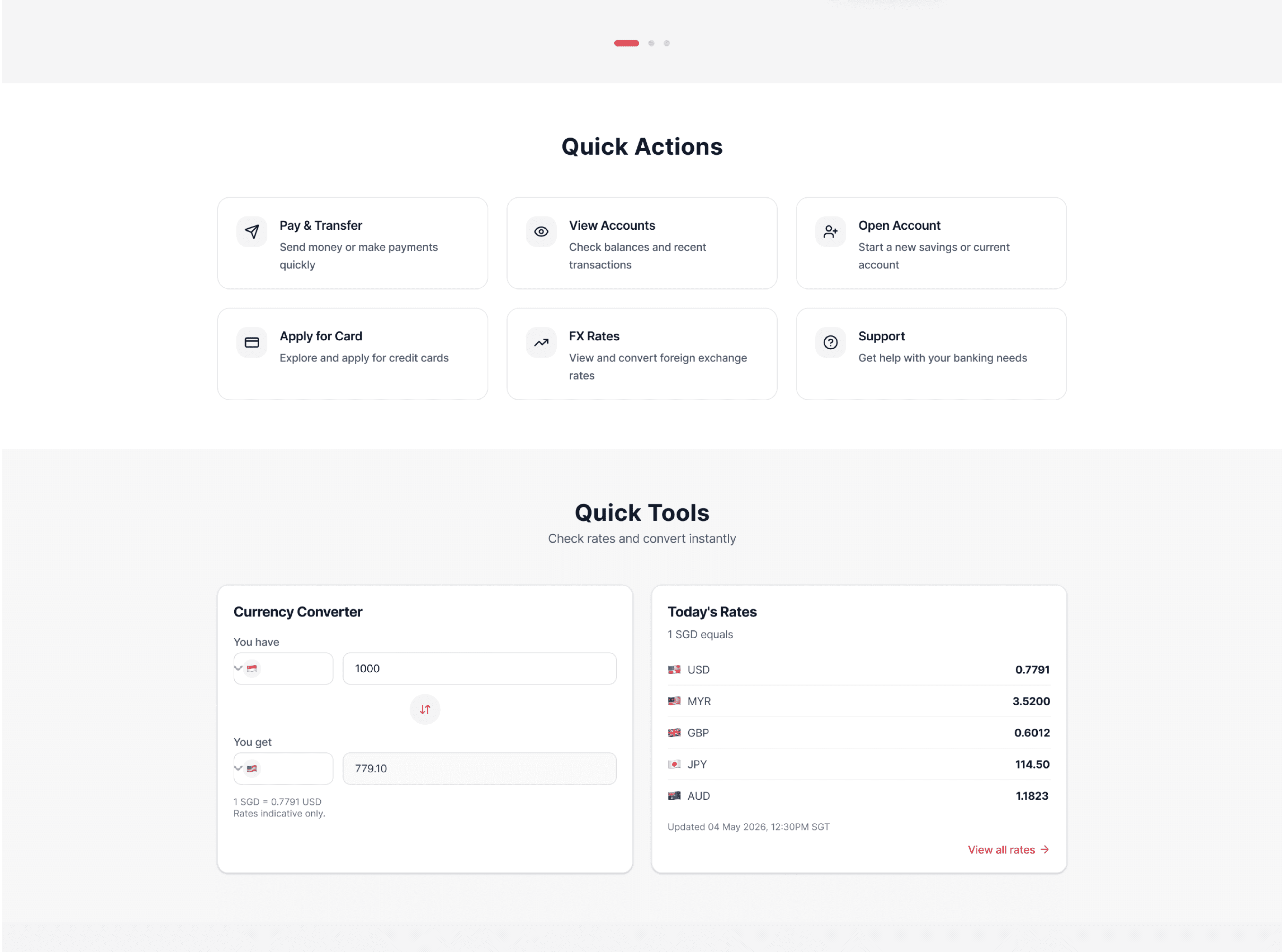
The banner and quick links were separated into distinct sections, each with a clear job. Quick Actions got supporting subtext so users immediately understand where each link leads, removing the guesswork the original icon row created.
I opted to reduce the use of images and focused on simple, monoline icons to reduce visual noise. On mobile, quick actions move into the sidebar drawer rather than competing for space in the nav bar, keeping the primary navigation clean and actions discoverable without clutter.
A/B Validation (4 Participants)
Metric | DBS | Redesign |
|---|---|---|
Task Findability | 4.0/5 | 4.0/5 |
Page Clarity | 3.75/5 | 4.75/5 |
Trust | 3.75/5 | 4.5/5 |
Overall Preference | 1/4 | 3/4 |
Ran a quick A/B test with 4 people to see if the changes actually made a difference beyond looking cleaner. Trust and clarity scores improved. Task findability was close where the original site's familiarity likely played a part.
Next step would be testing with people who don't use DBS, and revisiting whether the floating nav belongs in a banking context at all.
Tools: Figma Make
Prototype: 💰 Try it Here
Get in touch